This group is for all things Community Hub, including how-to's, help documentation, surveys, and more! For technical questions, please be sure to post those in the applicable product group by clicking on the Community Support link above.
Inserting multiple rows in a table can be very time consuming. In this Excel tip, rows will be inserted based on the specified number in a column. This will be accomplished using Power Query.
Download the workbook to practice.
In the example be...
Sometimes when importing data from another program into Microsoft® Excel®, the numbers are stored as text which causes havoc in your report. In some instances, the simple method of changing the format of the column to numbers will work, but o...
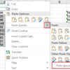
Sometimes when working in Excel, you may want to change the colour in multiple cells without having to do each one separately. For our example below, we are going to change the blue colour to green.
You're welcome to download the workbook t...
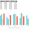
In an Excel chart, the series is in a particular order, and the legend entries are listed in their own particular order based on certain criteria.
Sometimes, there's a need to move the series within a chart or within a legend. It's easi...
It's not always possible to get a slicer to display in the order that you need it to.
In our example, the sample displays in an alphabetical order, but we'd like it to display in the same order being used in the Pivot Table. ...
Using Excel, have you tried to add a bullet point within a field to stack numbers, sentences or phrases? Adding a bullet point helps the reader to see each point clearly rather than viewing several run-on sentences or numbers. Here are a ...
You don’t have to create complicated formulas to combine text from multiple columns to a single column. In this Excel tip, we will show you how to quickly and easily combine your data from multiple columns into one column.
In the example below...
Have you ever wanted to personalize your chart headings to further enhance the user’s report experience? In this tip we will show you how to customize chart titles according to the filter chosen.
I have a simple report that...
Most people who view financial reports prefer to look at the highest account level first then open the detail when needed. In this tip, we will show you how to set up groups using Microsoft® Excel® to hide account detail. For this...
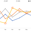
It is sometimes not always easy to trace which data point relates to which series in a chart, especially when it comes to a line chart. To overcome this problem, we can dynamically highlight an individual data point. Let’s get started.
Do...
Named ranges are an essential feature in Microsoft® Excel®. They are easy to use in formulas and can be used anywhere in a workbook. The trick comes in when you have to remember all the defined names you have created.
An easy way ...
When viewing numerical data in Excel, you may at some point want to represent this data visually. This gives you the ability to easily analyze large amounts of data. Charts and graphs also make your report look more professional and can even help whe...
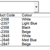
When using a data validation list, only one column of data is displayed, but sometimes there is a requirement for additional columns to be displayed simultaneously.
The multi column data validation list gives you the ability to look up data usi...
Have you ever experienced your Excel charts disappearing when you hide the columns showing the data? By default, Microsoft Excel shows only visible data in a chart. In this tip, we will show you how to easily overcome this problem, by f...
This Microsoft Excel tip will come in handy when you want to create a chart that will populate your data and highlight only specific parts of that data.
Download the workbook to practise this exercise.
In the example below, w...
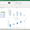
A step chart shows changes that occur over irregular intervals. For example, it can show stock movement changes, interest rates, etc. A step chart is the perfect alternative to a line chart as it displays the trend as well as the tim...
Data visualisation is fast becoming the norm for effective business intelligence. Having visuals that tell the right story at a glance go a long way in achieving this. Microsoft Excel provides you with a multitude of ways to enhance the...
These Microsoft Excel tips and tricks are the top performing tips of 2018, and have raked up a combined viewership of over 200 000. Without further ado, here they are, the Top 5 Excel tips and tricks of 2018.
How to con...
In a previous tip, we explained how you can easily remove duplicate rows from your data using the Remove Duplicates function. You can find it here. At times though, you may just want to highlight duplicate rows without actually deleting...
Have you ever had the pleasure (or displeasure) of working with an extra large Excel workbook with many, many different sheets? This happens frequently, especially if you are working with a large amount of data that needs to be analyzed periodically....
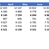
In our example workbook, we're working with Date, Value In and Value Out fields. We need to create a Pivot Table that will also display the variance per month, as well as a running total of the variance for the year. In this tip, we show you how to d...
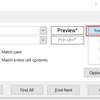
This tip is useful when you want to replace or find text using Wildcards, e.g. if you have a column where you would like to replace everything after the space character with text.
What are Wildcards?
Wildcards are characters that are used to repres...
Sorting data in alphabetical order or numerical order is helpful when you have large amounts of data in the PivotTable you created. Sorting lets you organize the data so it is easier to find the items you want to analyze.
1. Within the PivotTable, c...
This tip may seem basic, but with Microsoft continually adding value to its products—we just had to mention it. It's lead by a repository of every icon imaginable (and maybe even a few that are unimaginable) that you may find useful, especially if yo...